Design * UX Research

Helping an AP History Education Tool Increase User Retention

Pages from Engram's website with eye tracking data

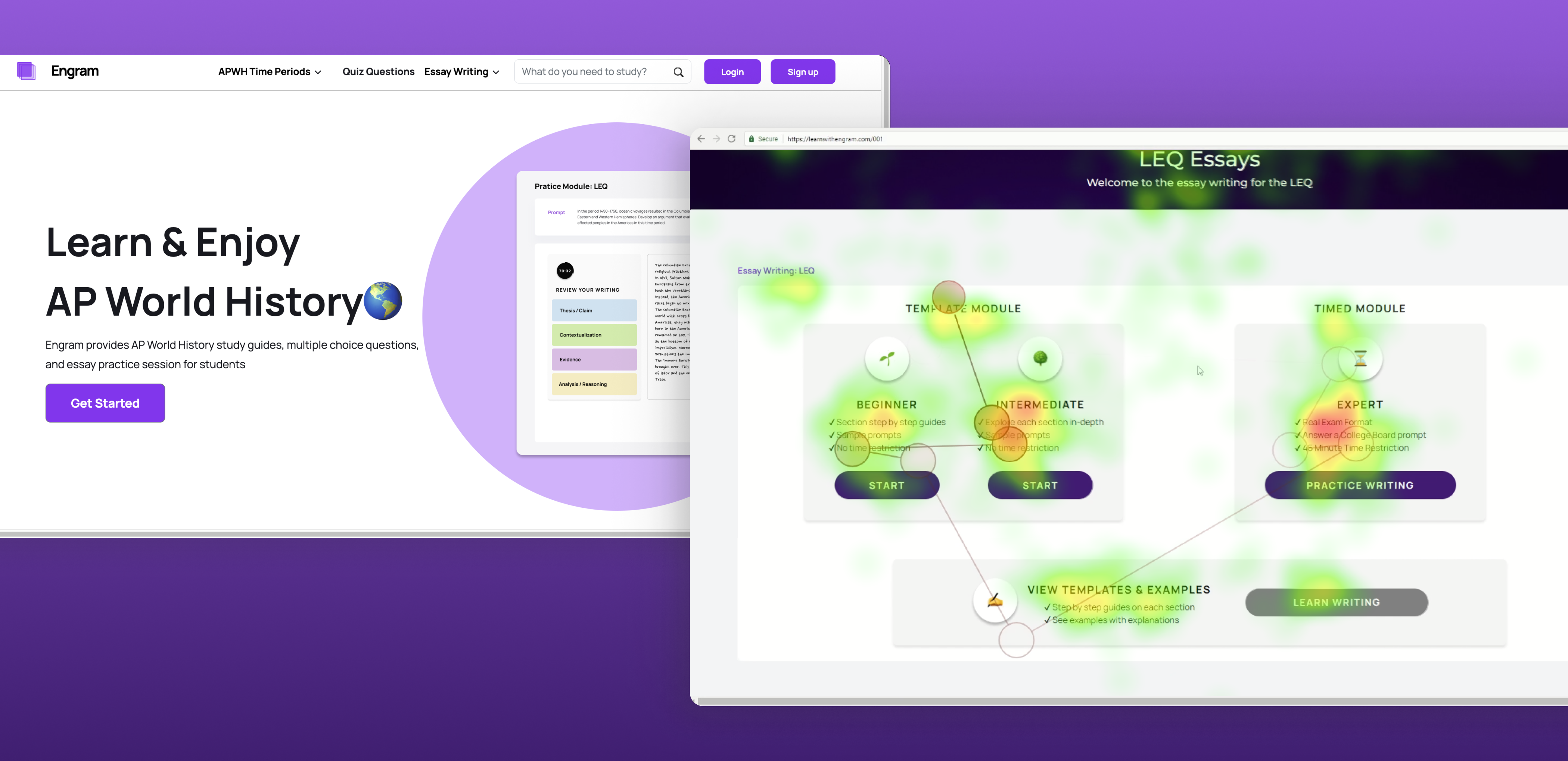
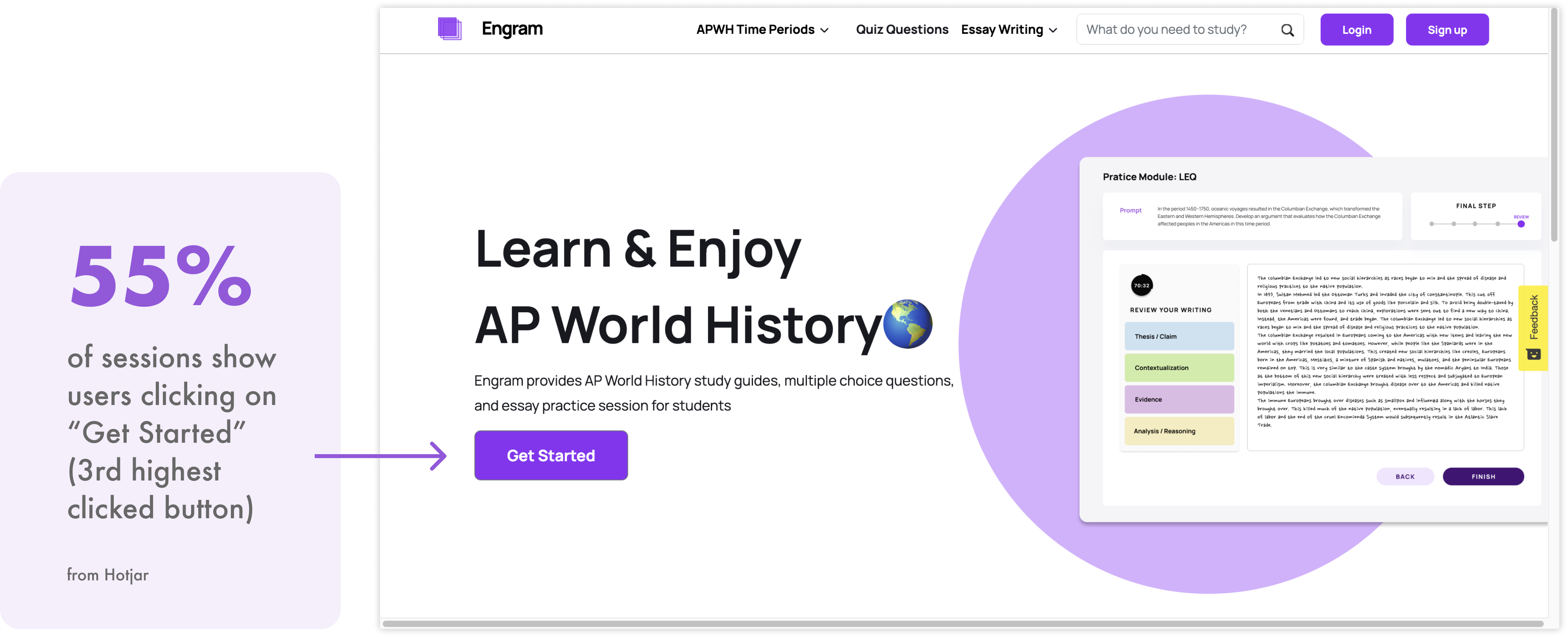
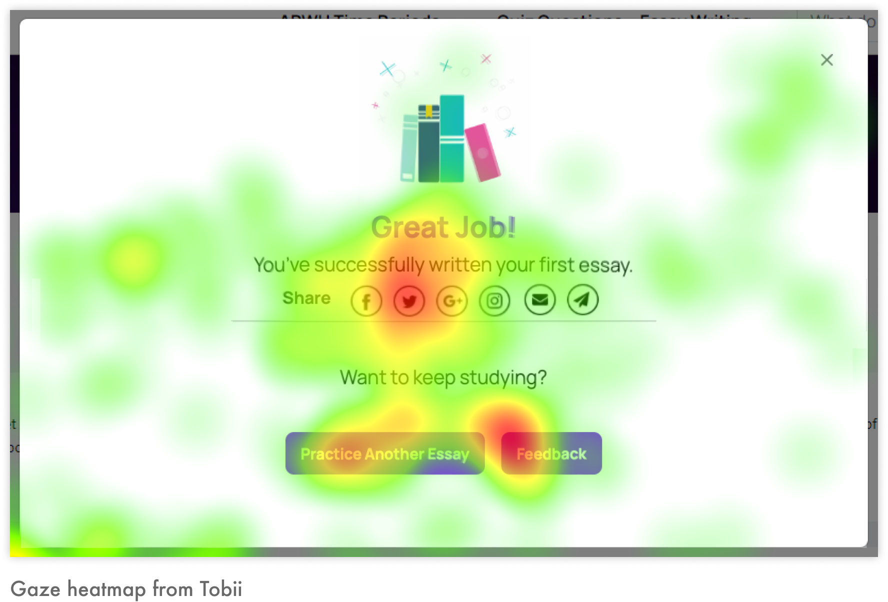
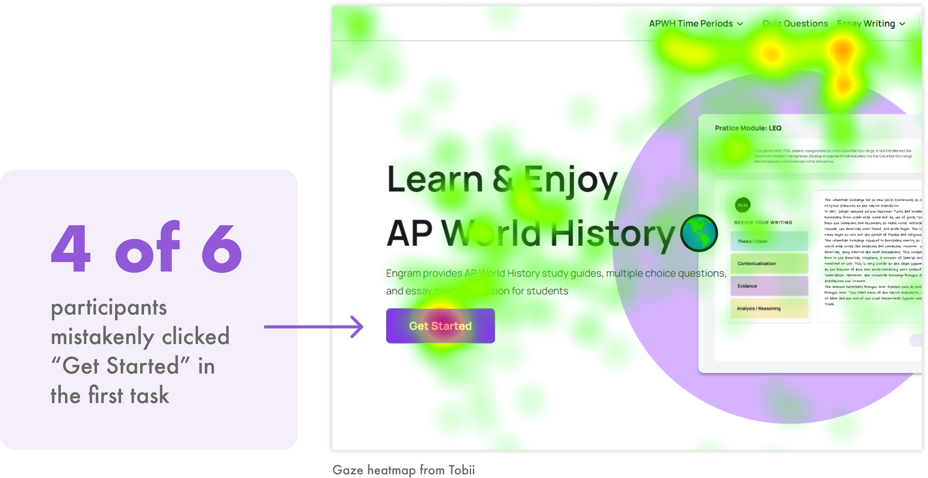
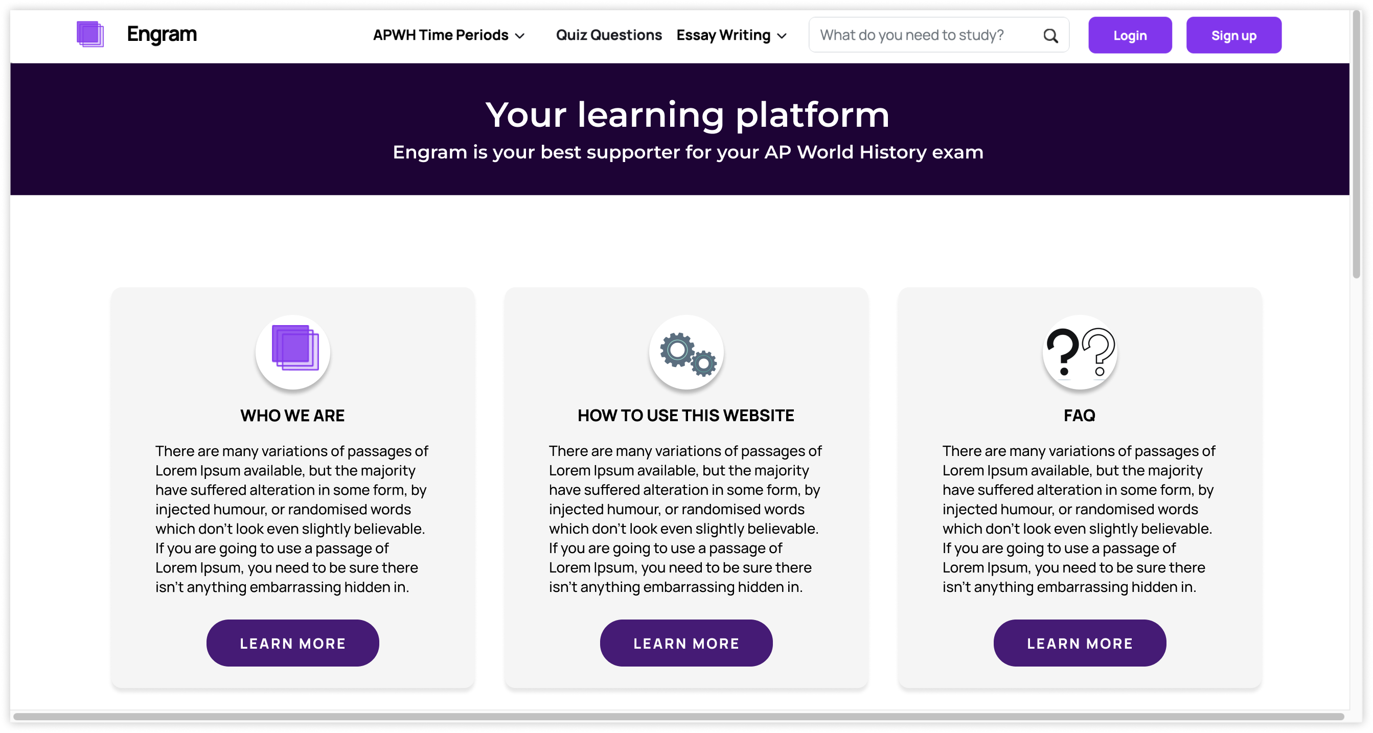
Engram is an AP World History education website that provides informative content, detailed quizzes, and thorough practice essays with feedback. Aiming to provide an engaging experience, Engram was in need of usability research to help increase user retention. This study investigated engagement with Engram using moderated usability testing with eye-tracking, and behavioral analytics data. The website was found to have efficient navigation and effective content overall, but we proposed improvements to the clarity of its call-to-action and guidance for its essay-writing features.

When: September - December 2023

Team: Mary Haws (me), Priyanka Jain, Becky Su

My Role: planning research, writing screening questions, recruiting participants, conducting pilot tests, moderating eye-tracking sessions, analyzing behavioral data, coding qualitative data, creating mockups, communicating findings

About Engram: Providing Tools for Learning and Enjoying AP World History

As an AP World History education website, Engram incorporates history units, practice quizzes, and practice essays with feedback. The website targets high school students taking AP World History, offering these tools to help them prepare for the AP exam. It aims to provide an engaging educational experience.

Our team meeting with the client

During our kickoff meeting with the client, we learned that Engram's goal was to increase user retention and engagement. Only about 57.8% of their total users were returning, with few exploring the site content and features deeply.

We also learned about Engram's future development plans, as parts of the website were not fully functional during the study. Insights from our study would inform how future improvements are prioritized as Engram's tools continue to be built.

Pie chart showing that 57.8% of users return to Engram (data from Hotjar)

Study Goal

Investigate Engram's existing engagement to propose improvements that will help increase user retention

Research Preparation

Analyzing behavioral data helped us plan our eye-tracking study

With our knowledge of Engram's current state and future plans, we looked to Google Analytics and Hotjar data to inform the design of our moderated usability tests, which would incorporate eye-tracking for deeper insights into Engram's engagement and retention.

The essay-writing page drew the most traffic, but also had the highest number of u-turns on the site

Engram's essay-writing section for practicing long essay questions (LEQs) had more views than another other page on the website. This high engagement occurred despite the essay-writing features being the least functional of the website.

The essay-writing page also had the highest number of u-turns on the site, with 31% of users leaving the page immediately after viewing it. This suggests confusion regarding the page contents.

Essay writing has the highest page views on Engram 31% of users leave the LEQ essay page after viewing it (from Hotjar)

We wrote two tasks to investigate this high engagement and high confusion on the LEQ essay page. The tasks captured the different difficulty levels provided by the essays modules, and instructed users to navigate to personalized essay feedback provided by Engram. View the scenario and all tasks from this study.

Engram's main call-to-action is a top-clicked button, but may be the cause of high u-turns from the essay-writing page

“Get Started” is Engram's call-to-action on the homepage. It is a top-clicked button on the website, and it leads to the essay-writing page. We hypothesized that “Get Started” leading users to the LEQ essay page might be the cause of confusion upon reaching that page.

'Get Started' is the third highest clicked button on Engram (in 55% of sessions, from Hotjar)

Rather than test the “Get Started” button directly in a task, we planned to closely observe interactions with it during testing and probe participants' expectations of it during a retrospective think-aloud. This would help us confirm our hypothesis that user expectation does not align with the button's behavior, therefore causing confusion on the essay-writing page.

Recruitment

We tried a variety of strategies to screen and recruit participants for our usability tests

Our screening questionnaire filtered potential participants based on their age, experience with AP history classes, and their learning/study habits. Our ideal participant was aged 18-22, had taken at least one AP history class, and was a motivated student.

From meeting with the client, we learned that Engram targets motivated students: those who might already use, or be most likely to seek out external resources to help them prepare for the AP exam.

Target participants are aged 18-22, have taken an AP history course, and are/were motivated students

How could we gauge which respondents were motivated AP history students?

Asking them how many hours per week they spent studying was considered, but was too subjective to measure motivation. We ultimately asked respondents to list the external resources they used while taking AP history, in addition to rating how motivated they felt to learn the AP history material and improve their AP score.

Screening question: 'How motivated are/were you to learn the material in your AP course and/or improve your score?' with answer choices from 'very motivated' to 'very unmotivated'

We had to adapt recruitment strategies and participant criteria to collect enough data

We saw low interest in our study from the target group, likely because we were recruiting in the middle of the semester and required in-person sessions to use the eye-tracking equipment. In order to recruit more participants, we pivoted from our initial recruitment strategy, which included reaching out to undergraduate students via email and social media, to a guerilla-like recruitment process by approaching students on campus. We also loosened our criteria to include slightly older and less-motivated students. A total of 6 participants were tested in our on-campus usability lab.

67% of our participants were aged 23-26, and 33% were 18-22; 67% were female, and 33% were nonbinary; 3 had taken AP World History, 4 has taken AP US History, and 1 had taken AP European History; 50% rated themselves as 'very motivated' to learn AP history, 16% rated 'somewhat motivated', 16% rated 'neutral', and 16% rated 'very unmotivated'

Recruitment setbacks shortened our timeline for data analysis

We lost about 10 days of budgeted analysis time, leaving about 2 weeks. We analyzed task performance via success rates and completion times, qualitative data via thematic analysis, and eye-tracking data via heatmaps and gaze replays. Responses to the System Usability Scale, post-task ratings, Google Analytics data, and Hotjar data were also incorporated in our analysis.

Engram's essay-writing features would benefit from more thorough guidance

The essay-writing tasks produced the lowest task success rates and ease ratings of all the tasks, highlighting pain points within the essay workflow on Engram:

Average success rates for tasks 1-7 were 83%, 100%, 100%, 100%, 50%, 66%, and 80% respectively; Average ease ratings out of 5 for tasks 1-7 were 4.20, 4.50, 4.67, 4.17, 3.63, 3.33, and 4.50 respectively; the essay tasks (tasks 5 and 6) scored 50% and 3.63, and 66% and 3.33 respectively

Finding #1

Participants struggled to choose between the essay modules

The descriptions and button labels for the three essays modules caused misunderstandings. 4 of 6 participants completed a module of the wrong difficulty level for at least one of the two essay tasks.

Engram has 3 module levels: beginner, intermediate, and expert

“I think if they all said 'Practice Writing' that would make more sense because then...it would make more sense to start beginner writing.

But the way it's formatted now it seems more like a tutorial when it says 'Start.'”

This confusion partially explains why the essay page has a high u-turn rate of 31%. Further analysis of behavioral data revealed that the essay page also has the longest average engagement time (2 minutes, 12 seconds) of any page on Engram, reinforcing the finding that users are confused when choosing a module.

2:12 is the longest average engagement time of any page on Engram (from Google Analytics)

Recommendation #1

Clarifying the essay-writing page and modules will help guide users to the essay practice that is best for them

We recommend dividing the essay-writing page into clear steps: the first should explain the AP exam's LEQs, and the second should provide practice modules. Grouping the modules within a common step and applying a consistent button label will make them appear like different levels of essay practice, rather than a mix of tutorials and essay writing. Users will be able to make their choice more efficiently and stay engaged with Engram's essay-writing tool.

Mockup showing clear steps restructuring the page: 'Step 1: What is the LEQ?' and 'Step 2: Practice Writing LEQs'; a consistent 'Start' label was added to each module

Finding #2

The button to view personalized essay feedback is hidden in a modal

Gaze replays and heatmaps revealed that participants saw the “Feedback” button in the essay submission modal, but their behavior did not demonstrate understanding. 3 of 6 participants did not view their feedback for at least one of the two essay tasks. 57% of sessions in which users submitted essays did not include viewing feedback either.

These findings suggest that the “Feedback” button is not salient enough to get users to click.

3 of 6 participants did not view feedback for at least one of the essay tasks; 57% of essays in which users submitted essays did not include viewing feedback (from Hotjar)

Recommendation #2

Making feedback more discoverable will guide users to a valuable feature of Engram's essay curriculum

We recommend directing users to feedback page upon submission of an essay, rather than having the extra modal step. The value of this feature, which participants fully appreciated, would then be automatically provided.

Mockup showing the essay submit button leadings directly to the feedback page

“Giving feedback for every part of the essay is really cool. It's helpful."

The primary call-to-action could better align with user expectations

The “Get Started” call-to-action button on the homepage had been a point of interest since we planned out our study. We found that “Get Started” does not align with user expectations.

Finding #3

The “Get Started” button was a focal point of the homepage, but its actual function confused users

4 of 6 participants were drawn to click “Get Started” for the first task, rather than navigating to history units for the correct answer. Those who clicked the button expressed confusion that it led to the essay-writing page. This insight, in addition to the data showing high clicks on “Get Started” and high u-turns from the essay page, suggests a mismatch between the button label and its function.

4 of 6 participants mistakenly clicked 'Get Started' in the first task; the gaze heatmap from Tobii from the homepage shows 'Get Started' as a focal point of the page

“I didn't really look at the top; my eye first went to “Get Started” and I didn't know it would specifically lead to essay writing.”

What did participants expect when clicking on “Get Started?”

We probed participants about their expectations of Engram's primary call-to-action after they completed the tasks. Here's what they expected:

Participants expected to create an account, to see a tutorial of the website, or to see history topics when clicking on get started

Recommendation #3

We came up with two call-to-action options that accommodate different directions in Engram's development

The first option is to align the call-to-action label with its current function in navigating to the essay-writing section of the website. This would reduce users' misunderstandings as to the purpose of the button, and is a quick fix if Engram wants to keep prioritizing essay-writing:

Mockup showing 'Get Started' label changed to 'Practice Writing'

The second option is to align the call-to-action's function with its current label, keeping “Get Started” but navigating users to a more introductory page. This reflects what we heard from users about their expectations for “Get Started.” This is a more aspirational recommendation for Engram, and can be applied if appropriate for their growth:

Mockup showing a sample introductory page that 'Get Started' will navigate to

Our results inspired deeper discussions about how to approach Engram's growth

We communicated our findings to the client via a slide deck report. This presentation included a detailed summary of our study, usability metrics and data, findings, evidence, and recommendations. It contained a total of 11 recommendations with mockups, and a list of 15 problems we discovered (ranging from from severe to minor).

“This highlighted some of the gut feelings of confusion that I felt, but I didn't know how, or what, or even how to fix it.

So I definitely feel like this identified a lot of the confusion that I even experienced with the site.”

Our presentation sparked positive reactions and a deeper discussion about the future direction of Engram, as they plan to build out and improve its tools with the goal of retaining more users. We were able to advise on how to prioritize changes to Engram, and give opinions on unexplored topics based on our knowledge of the the site's usability and user perceptions. The Engram team plans to implement our recommendations during the next six months.

"For nothing was simply one thing."
- Virginia Woolf,
To the Lighthouse